When people ask me why I prefer Android over that (cough, cough) other mobile platform, the answer is a little complicated.
Sure, I like the diversity and different options Android affords me in terms of hardware — both with the more mundane, standard sorts of choices and the cutting-edge, adventurous form possibilities. And yes, as someone who very much lives and works within Google’s ecosystem, I enjoy the tighter integration of those services and the better all-around experience I have with them on Android.
I’ve generally never been a fan of Apple’s design style, either, and I find lots of things about the iOS interface to be clunky and awkward.
More than anything, though, these and other similar factors point to the same underlying principle — and what I think really gets at why I’ve been enamored with Android as both a writer and a user for some 16 years now: I appreciate the ability to make my phone work the way I want and the way that makes sense for my own personal style of working. From the hardware to the software and the rich app ecosystem around it, that’s something Android has always embraced and Apple has always resisted.
For me, the most important practical piece of that puzzle is having the ability to change defaults, install advanced efficiency apps, and customize practically every facet of my phone’s interface to make it as personalized and effective as possible for me — and, again, for my specific style of getting stuff done. And there’s no place where that advantage is more apparent than in my phone’s home screen and the associated elements that control how I get around my device each and every day.
[Psst: Love time-savers as much as I do? My Android Shortcut Supercourse will teach you tons of efficiency-enhancing secrets for your phone. Sign up now for free!]
I’m always thinking about ways I can optimize and improve my smartphone setup even further — because Android grants me endless opportunities to do so, and the platform’s community of creative developers embraces that ability and constantly comes out with clever new concepts.
And recently, dear reader, I had a revelation. It’s completely changed the way I use and get around my phone and eliminated tons of inefficiencies. And I’ve got a sneaking suspicion it might just do the same for you.
My Android app drawer epiphany
So first things first: You know about Android launchers, right?
Android launchers are a special category of apps on Android that let you replace your entire home screen environment with a totally different interface. It might be simpler, it might be more customizable, or it might just be a completely different and maybe even unusual kind of concept. There are all sorts of interesting options out there, and the power to choose and find a setup that makes sense for you is entirely in your hands.
For years now, I’ve been partial to a thoughtful and unconventional Android launcher called Niagara Launcher. It’s all about ergonomic efficiency, and I’ve found its model for helping you find what you need quickly and without distractions to be incredibly effective for the way I like to work.
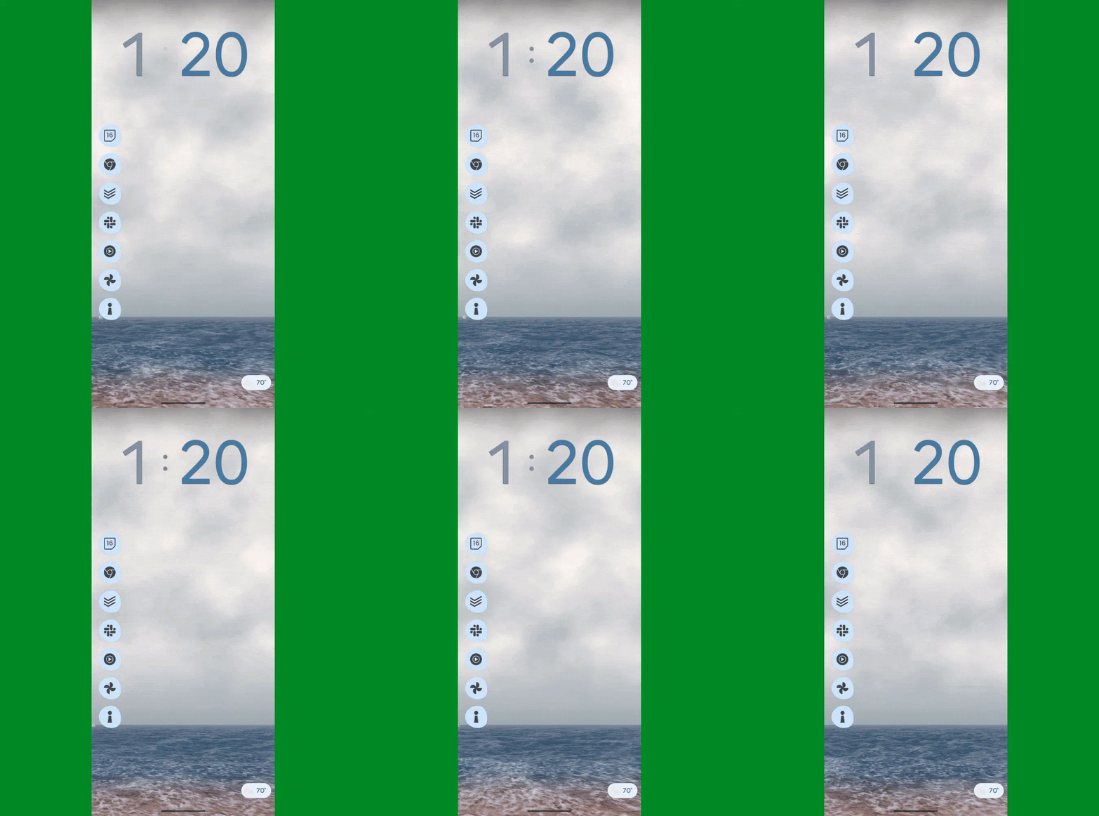
A key part of that comes down to Niagara’s simple vertical lists for opening up apps. Your favorite apps are always in a single column at the left side of your home screen — a spot that’s extremely ergonomic for me, since I tend to hold my phone in my left hand and thus can access all of that easily even during single-handed use — and you then just swipe your finger up or down on either side of your screen to scroll through all of your installed apps whenever you need to find anything else.
My revelation is actually two-fold, all related to that Niagara app access concept. The first part is a totally new take on my home screen involving a different launcher where I’ve recreated that same core Niagara setup and injected a bunch of other advanced efficiency-enhancers into the equation — most of which are hidden out of sight, to maintain a minimal and distraction-free vibe, and accessible via a series of carefully conceived on-screen gestures.

JR Raphael, IDG
It’s quite the zesty stew of creative customization, every last detail of which I’ve shared in my Intelligence Insider Community for my fellow uber-nerds to enjoy and optionally even implement on their own (whether entirely or in selected bits and pieces) — including all of the uncommon touches and out-of-sight efficiency-optimizers I’ve worked weeks to refine and perfect.
Here, though, I want to focus on the second part of that revelation, and that’s all about the app drawer, specifically, and how I’m now finding and opening apps without the time-wasting traipsing that typically accompanies that.
My appreciation of the Niagara scrolling-letter-list model, y’see, led me to have the thought: “Hmm — what if I could recreate this same concept and take it up a notch by making it available not just on my home screen but from anywhere on my phone?”
After all, the most common action most of us take throughout the day is heading back to our home screen to open something. So what if I could cut out that middle-man step entirely and simply swipe along the side of my screen from anywhere to find and open what I want next — whether I’m in my email, my browser, my messages, whatever — without having to first head back to my home screen time and time again?
Being that this is Android and we’re granted the power to make our phones work the way we want them to work, that’s not only possible but also quite easy to accomplish. And — oh, yes — I’ve found the perfect way to make it happen.
The Android app drawer, unshackled
If you’ve been following my Android-scented ramblings for long, you’ve probably heard me rave about the sheer awesomeness of an app called Panels before.
Panels is the kind of app that could only exist on Android. As its name suggests, it lets you create custom panels that pop up when you perform specific gestures along the edges of your phone’s display — like swiping up or down in that area.
I’ve traditionally used Panels to provide easily accessible pop-ups for accessing Android widgets from anywhere. One swipe in a certain preset place, and boom: I can glance at the latest emails in my inbox or access my two-factor authentication codes no matter what else I’m in the midst of doing and without having to waste time going back to my home screen and then opening the associated app from there.
But Panels has another ability beyond those custom widget panels, and that’s giving you an on-demand app drawer you can summon from anywhere on your device.
It works a lot like my trusty old Niagara app list, too, with a simple swiping up and down to move through the list and find the exact app you need at any given moment.
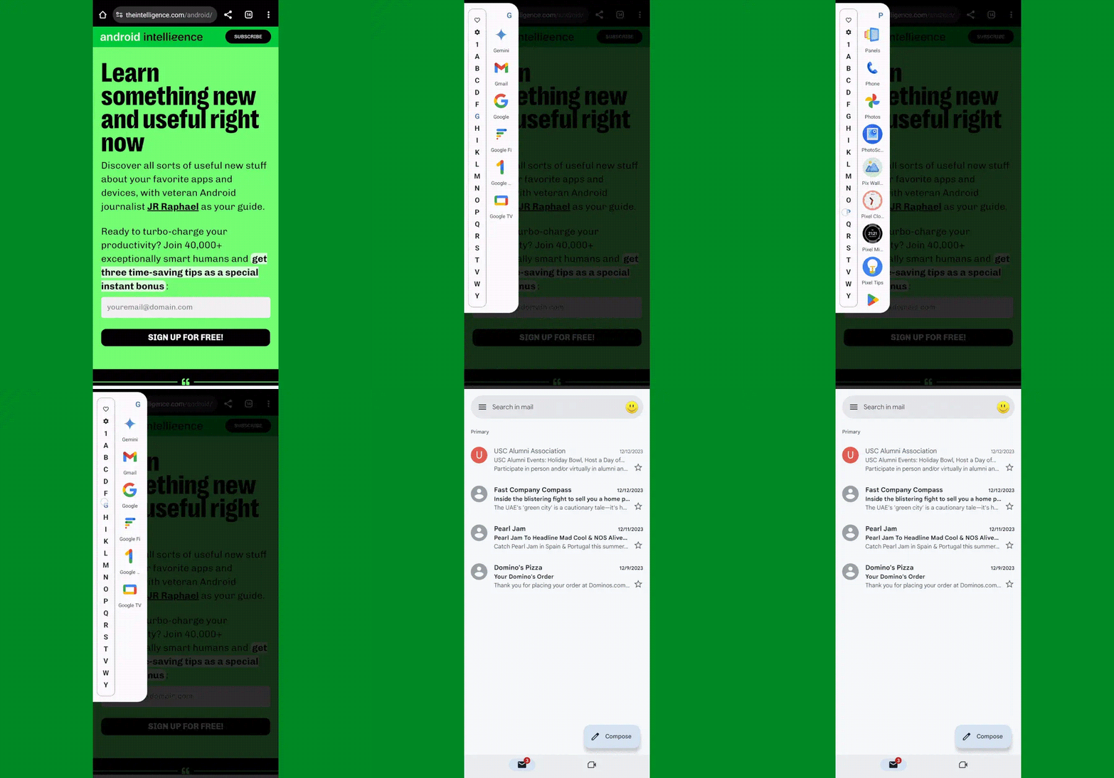
But with Panels, critically, you don’t have to be on your home screen to access that interface. You can set up the app to show you the list as an overlay and effectively give you super-efficient access to your entire Android app drawer universally — with a simple side-of-screen swiping gesture that works on your home screen as well as within any other app or process.
Just one swipe up or down the side of your screen, aaaaand poof: There’s your entire Android app drawer — available in a neatly organized, efficiency-optimized list. You can swipe or tap to reach the letter you want or lean on the favorites to find apps you open often. And, most significantly, again: You can get to all of that from anywhere, without having to first fumble your way back to your home screen and waste countless seconds throughout the day. It essentially extends that part of your home screen throughout your entire device, which is a pretty awesome power to have.

JR Raphael, IDG
Setting it up is surprisingly simple — and something you’ll only have to do one time:
- First, download and install Panels from the Play Store.
- Open the app and follow the prompts to allow it to send notifications and to display over other apps (two innocuous permissions that are legitimately required for the app to do what it needs to do).
- Now, on the app’s main setup screen, tap “View.”
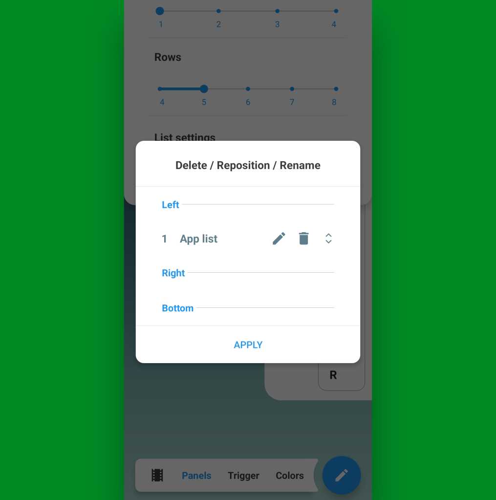
- Tap the circular blue pencil icon in the lower-right corner of the screen that comes up next and tap “Delete / Reposition / Rename.”
- Tap the trash can icon next to both “Apps and shortcuts” and “Widgets” — two sample panels that are present in the app by default but that you won’t need for these purposes.
- That should leave you with only one remaining panel, called “App list.”

JR Raphael, IDG
At this point, all that’s left is to think about if you want to have your on-demand app drawer available via a swipe on the left or the right side of your screen. I tend to hold my phone in my left hand, personally, so for me, swiping on the left side of the screen with my thumb is the easiest and most ergonomic gesture. If you hold your phone in your right hand, you might prefer using the right side.
Whichever you choose, make sure the “App list” item is in the appropriate place within that same menu we were just looking at. If you need to move it, press and hold on the right side of its line to drag it into whichever position you want, then tap “Apply.”
And take a deep breath: We’re almost done! At this point, all that’s left are the little details and some opportunities for even more advanced customization.
Some things to consider:
- In the main “Panels” menu on that same settings screen, you may want to extend the length of the “Rows” option to make the list longer and allow it to take up the entire height of your screen without wrapping over to a second line.
- Within that same menu, tapping “List settings” will reveal a series of options for determining if your on-demand app drawer shows recently opened apps, recently installed apps, and recently updated apps along with specific links to different sections of your system settings. You can also manually hide certain apps from the list and prevent ’em from showing up in the list at all, if you have some apps you don’t anticipate ever needing to access.
- If you tap “Trigger” in the main menu selector at the bottom of the screen, you can change the width, height, and precise positioning of the part of your screen where the swipe gesture will be recognized. This may require a bit of experimentation to figure out the optimal placement for you. I like to keep the trigger zone fairly high up on the side of my screen, where (a) I’m unlikely to activate it on accident and (b) it’s easy to reach effortlessly near the spot where my thumb already tends to rest.
- In that same “Trigger” menu, take note of the “Visible width” and “Invisible width” options. By default, Panels will put a thin colored line on the side of your screen to remind you where you can swipe to summon your app drawer. That’s fine if you like it — or if you want to have it there for a little while, until you get used to the idea of using this — but personally, I prefer setting that value to zero and leaving only the “Invisible width” present (meaning there’s no line or visible indication of the panel’s presence on my screen, and I just know where to swipe to find it).
- And note, too, the “Prioritize the back gesture over the trigger” option. If you use Android’s gesture navigation, you’ll almost certainly want to activate that to avoid any conflicts.
- Last but not least, under the “Colors” menu, you can customize the appearance of your panel, if you ever want to play around with that and do something different than the default.
And that, my fellow Android-adoring animal, is about it! Panels doesn’t require any manner of eyebrow-raising permissions, nor does the app collect any kind of personal data. It’s free to use with an optional in-app upgrade to remove some limitations, unlock extra options, and eliminate ads within the configuration interface (and note, if you’re a member of my Intelligence Insider club, you actually have a free lifetime upgrade to the full premium version of Panels as part of your Insider Perk Pack).
I hope you enjoy your new on-demand app drawer as much as I’m enjoying mine — and I hope its presence gives you a renewed appreciation for the choice, flexibility, and genuine practical benefits Android’s approach allows us, just as it has for me.
Get six full days of advanced Android knowledge with my free Android Shortcut Supercourse. You’ll learn tons of time-saving tricks for your phone!

