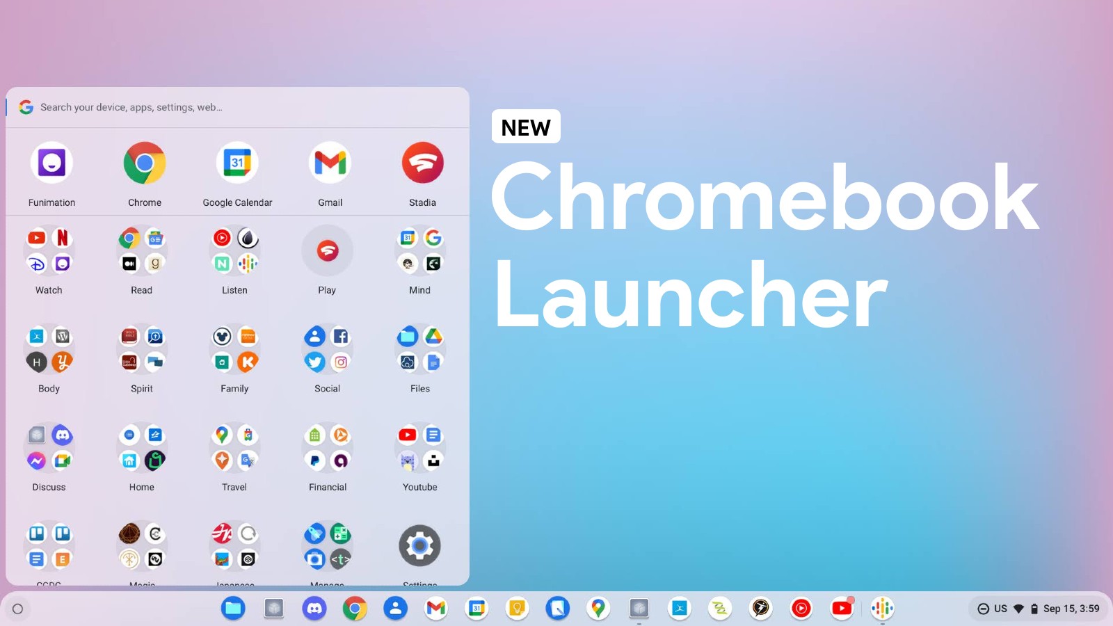
ChromeOS is always getting new features, and while these start out in the Canary channel for early testing, they often find their way to the Stable release for everyone to use. The latest one is a small but helpful addition to the launcher. Now, in ChromeOS Canary 115, folders that contain more than four apps or web apps will have a colorful number badge next to them, letting you know how many items are inside.
An important note is that it doesn’t show you the count of the entire folder, but rather the number of apps that are out of view and hidden away in the folder. It does not count the three apps that can be previewed just by looking in the launcher root.

This is a great way to see at a glance how stuffed a folder is, so you can decide if it’s worth opening or needs to be cleaned out. Previously, folders could have a bunch of things inside of them and you wouldn’t even know it until you expanded them. This new feature makes it much easier to keep your launcher organized and tidy.
One thing I hope is added in the future is a way to see the folder’s capacity. Imagine opening one and it states that your capacity is “x/30”, for example. Most users probably aren’t aware that folders have limits, but when I used to install a hundreds of games and attempted to keep them organized (before I realized that ChromeOS doesn’t sync your changes for crap), I hit that ceiling and was forced to place things in a secondary folder.
These badges seem to follow the Material You theming that Chromebooks are now implementing, so if you change your wallpaper, these icon numbers should also adapt dynamically to the primary color of that image in the same way that your quick settings tiles and other accented elements do.


