

The new Chromebook virtual keyboard is a joy to use, and it’s all thanks to psychology. In the latest ChromeOS Canary 115 update, a redesigned virtual keyboard has made its appearance, and I must say, it has completely transformed my typing experience. Surprisingly, the changes are minimal at a glance, but they reflect a profound shift in the keyboard’s philosophy, with a greater emphasis on accessibility and an understanding of how the human brain functions. Soon, you’ll be able to enjoy a less cluttered and more user-friendly virtual keyboard for yourself.
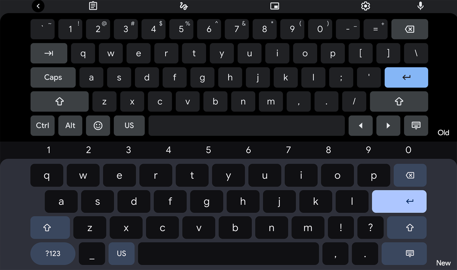
One of the significant changes you’ll notice is the larger buttons with more prominent lettering. This enhancement was made possible by relocating the number keys from the keyboard to the top row, where your keyboard settings are usually found. When you need to input numbers, the number row will appear, but otherwise, it remains hidden. In the current design, the numbers are always visible on the top row, regardless of their necessity.
Furthermore, the virtual keyboard has shed the alternate use cases for each key, as well as the Ctrl/Alt/Arrows/tilde/minus/equals keys, which used to clutter the interface. Now, any alt symbols you would typically access by holding the shift key and pressing another key are hidden behind the keyboard until you switch to numbers or symbols. While some may argue that this change affects accessibility, I find it much easier on the brain and incredibly refreshing to use.
The keys themselves have undergone a subtle transformation, becoming slightly more rounded. This adjustment allows for more visual separation between each key, and although it may seem insignificant, you’ll immediately notice the difference when you start using the new keyboard. In terms of accessibility, the increased visual separation complements the next change. It’s worth mentioning that Google has previously experimented with completely rounded keys, but they found that it created excessive spacing between the keys, which proved distracting. The current design strikes a perfect balance.
Another noteworthy alteration is the reversed coloring of the keys and the keyboard’s background. Instead of a black background in dark mode with slightly lighter keys and white lettering, the keys are now nearly black, while the background takes on a dark blue shade that is noticeably lighter. This visual distinction greatly enhances key recognition, (again, in conjunction with the larger keys, more prominent lettering, and rounded corners, as previously stated). In my personal opinion, the new color scheme is a hundred times better and eliminates any confusion about the function of each key (you can thank the new “Jelly Colors” developer flag for this).
Interesting: The functional keys like Enter, Caps, Backspace, dismiss keyboard, etc. have had their iconography offset from their button’s center for some reason. I think this has the psychological effect of taking attention away from them while you’re typing (they don’t attract your eyes in a sticky way at the edges of the right-most or left-most alphabetical keys) and toward them when you do want to look at them since they’re odd and out of place.
Finally, Google has paid careful attention to color and shape when it comes to the non-lettered keys. Previously, these keys, such as those for numbering and capitalizing, were either smaller or had the same shape as the alphabetical keys. However, they now sport a variety of distinctive shapes. The alternate numeric keyboard switcher is pill-shaped, the return key and keyboard dismissal button are larger and stand out, while keys like caps lock, language switcher, and backspace are smaller, drawing less attention and occupying less space.
Although the width of the keyboard remains the same, the collective impact of all these changes gives an illusion of increased spaciousness. There seems to be additional space on the left and right sides, but it’s a clever trick of the mind, thanks to the excellent design choices made by the ChromeOS team.
While a bit geeky, my love for UX design made sure these changes didn’t escape me, and I was immediately captivated by them, so I thought I’d share them with you all. The new virtual keyboard for Chromebooks is set to bring a delightful typing experience to everyone once it launches, and I hope you like it as much as I do!
Newsletter Signup
