It’s been a little while since we last talked about the enhanced split-screen features coming to ChromeOS, but they are finally beginning to arrive in the Beta Channel of ChromeOS 114 with no need for any setup, flags, tweaks, or changes to start taking advantage of them. It’s a needed addition if you ask me, and one that I think will make a ton more sense especially as you see how it works on touch-enabled devices when in tablet mode.
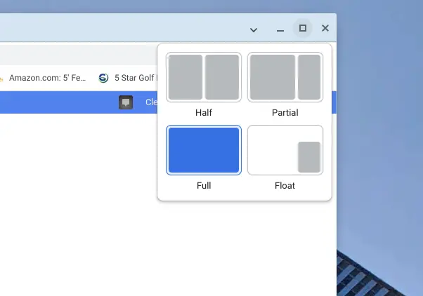
Now don’t get me wrong: the setup is pretty sweet for desktop mode, too. To see all the layout options, you simply hover the window expand button between the minimize and close buttons at the top of any window. Once you do, a small window will appear that give you all the new options for your current window.
Once you choose the one you want, your window will animate to that size and location and is ready for use immediately. The first three options are self explanatory (half, partial, and full), but the fourth is pretty sweet once you know what it does. Clicking the float option will give you an always-on-top window that can be left in the corner for things you know you constantly need. Whether its a messaging app, a task-based app, or something else, having a quick way to basically pin any window in the corner is a nice touch, and the fact that it stays on top makes it a very interesting option.
How it works in tablet mode
For tablet mode, all the same options are available, but you access them with a simple swipe down from the top of any open window. After selecting from the same options, your windows will head to where you’ve directed them and you can then swipe down on any split-screen window to change those orientations afterwards.

And the floating window has a few extra ticks when in tablet mode, too. If you choose to drop a window into the float mode while in the ChromeOS tablet mode, it will drop to the corner and stay on top, but it also gets the added benefit of being able to be hidden. Swipe across the top bar of the floated window and it will disappear off screen and can be recalled with a small button that is left on the screen’s edge after its exit.

Overall, it’s a fairly intuitive way to add some extra, pre-set screen setups to your Chromebook, and the whole thing is already in what looks like good enough shape to likely show up in early June when ChromeOS 114 is set to hit the Stable Channel. There are a few other Beta things I’m testing at the moment, but this is one feature (along with all the new Material You additions in ChromeOS 114) that will likely keep me in the Beta mode until 114 hits the Stable Channel in a few weeks. If you’re in ChromeOS Beta 114 already, check this one out and let us know what you think about it.


