
In contrast to Coca Cola’s classic design, many tech giants, including Google, often change logos mure more frequently. Over the past decade, Google’s app logos have undergone several transformations, especially as it’s has implemented flat design and Material You.
Sadly, many of them use a wacky four color palette that makes it near impossible to differentiate them at a glance. Now, a brand new visual refresh for the Google Play Books logo has been discovered and luckily, it’s using a clean two-tone design!
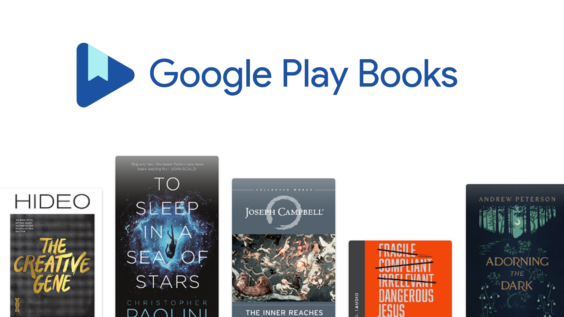
First discovered by a user named Kayvon (kudos: 9to5Google) on the Google Takeout page, the new logo features a Material design that removes the book and replaces it with a single bookmark placed inside the Play triangle. The corners are more rounded than the previous design, and the image has a darker blue color with a light blue bookmark, unlike the white in the previous design.
Since the launch of Google Play Books in December of 2010, its logo has undergone several drastic rebranding efforts. The first design was a four-color Googley book icon. That was quickly followed up every two years with a new one like the sapphire-looking book icon in 2012, the forward-facing book in 2014, and finally, the logo that we all know in 2016.

Anyway, what are your thoughts on the new iconography? Do you prefer it over the previous designs? While I do think it’s overall more aesthetically pleasing, I’ll miss the lighter blue color that’s defined it for the past decade. Let us know in the comments which app you prefer for reading – Play Books, Amazon Kindle, or something else entirely!
Newsletter Signup
