What a long, strange trip it’s been.
From its inaugural release to today, Android has transformed visually, conceptually and functionally — time and time again. Google’s mobile operating system may have started out scrappy, but holy moly, has it ever evolved.
Here’s a fast-paced tour of Android version highlights from the platform’s birth to present. (Feel free to skip ahead if you just want to see what’s new in Android 14 or the actively-under-development Android 15 beta release.)
Android versions 1.0 to 1.1: The early days
Android made its official public debut in 2008 with Android 1.0 — a release so ancient it didn’t even have a cute codename.
Things were pretty basic back then, but the software did include a suite of early Google apps like Gmail, Maps, Calendar, and YouTube, all of which were integrated into the operating system — a stark contrast to the more easily updatable standalone-app model employed today.

The Android 1.0 home screen and its rudimentary web browser (not yet called Chrome).
T-Mobile
Android version 1.5: Cupcake
With early 2009’s Android 1.5 Cupcake release, the tradition of Android version names was born. Cupcake introduced numerous refinements to the Android interface, including the first on-screen keyboard — something that’d be necessary as phones moved away from the once-ubiquitous physical keyboard model.
Cupcake also brought about the framework for third-party app widgets, which would quickly turn into one of Android’s most distinguishing elements, and it provided the platform’s first-ever option for video recording.

Cupcake was all about the widgets.
Android version 1.6: Donut
Android 1.6, Donut, rolled into the world in the fall of 2009. Donut filled in some important holes in Android’s center, including the ability for the OS to operate on a variety of different screen sizes and resolutions — a factor that’d be critical in the years to come. It also added support for CDMA networks like Verizon, which would play a key role in Android’s imminent explosion.

Android’s universal search box made its first appearance in Android 1.6.
Android versions 2.0 to 2.1: Eclair
Keeping up the breakneck release pace of Android’s early years, Android 2.0, Eclair, emerged just six weeks after Donut; its “point-one” update, also called Eclair, came out a couple months later. Eclair was the first Android release to enter mainstream consciousness thanks to the original Motorola Droid phone and the massive Verizon-led marketing campaign surrounding it.
Verizon’s “iDon’t” ad for the Droid.
The release’s most transformative element was the addition of voice-guided turn-by-turn navigation and real-time traffic info — something previously unheard of (and still essentially unmatched) in the smartphone world. Navigation aside, Eclair brought live wallpapers to Android as well as the platform’s first speech-to-text function. And it made waves for injecting the once-iOS-exclusive pinch-to-zoom capability into Android — a move often seen as the spark that ignited Apple’s long-lasting “thermonuclear war” against Google.
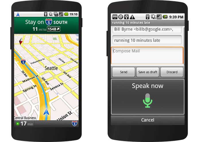
The first versions of turn-by-turn navigation and speech-to-text, in Eclair.
Android version 2.2: Froyo
Just four months after Android 2.1 arrived, Google served up Android 2.2, Froyo, which revolved largely around under-the-hood performance improvements.
Froyo did deliver some important front-facing features, though, including the addition of the now-standard dock at the bottom of the home screen as well as the first incarnation of Voice Actions, which allowed you to perform basic functions like getting directions and making notes by tapping an icon and then speaking a command.
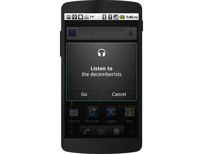
Google’s first real attempt at voice control, in Froyo.
Notably, Froyo also brought support for Flash to Android’s web browser — an option that was significant both because of the widespread use of Flash at the time and because of Apple’s adamant stance against supporting it on its own mobile devices. Apple would eventually win, of course, and Flash would become far less common. But back when it was still everywhere, being able to access the full web without any black holes was a genuine advantage only Android could offer.
Android version 2.3: Gingerbread
Android’s first true visual identity started coming into focus with 2010’s Gingerbread release. Bright green had long been the color of Android’s robot mascot, and with Gingerbread, it became an integral part of the operating system’s appearance. Black and green seeped all over the UI as Android started its slow march toward distinctive design.
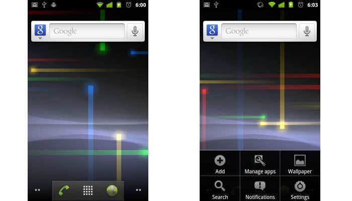
It was easy being green back in the Gingerbread days.
JR Raphael / IDG
Android 3.0 to 3.2: Honeycomb
2011’s Honeycomb period was a weird time for Android. Android 3.0 came into the world as a tablet-only release to accompany the launch of the Motorola Xoom, and through the subsequent 3.1 and 3.2 updates, it remained a tablet-exclusive (and closed-source) entity.
Under the guidance of newly arrived design chief Matias Duarte, Honeycomb introduced a dramatically reimagined UI for Android. It had a space-like “holographic” design that traded the platform’s trademark green for blue and placed an emphasis on making the most of a tablet’s screen space.
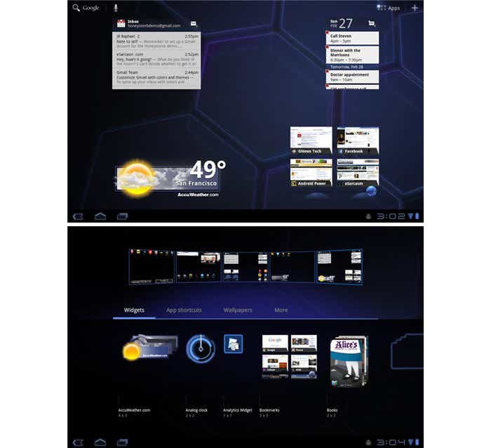
Honeycomb: When Android got a case of the holographic blues.
JR Raphael / IDG
While the concept of a tablet-specific interface didn’t last long, many of Honeycomb’s ideas laid the groundwork for the Android we know today. The software was the first to use on-screen buttons for Android’s main navigational commands; it marked the beginning of the end for the permanent overflow-menu button; and it introduced the concept of a card-like UI with its take on the Recent Apps list.
Android version 4.0: Ice Cream Sandwich
With Honeycomb acting as the bridge from old to new, Ice Cream Sandwich — also released in 2011 — served as the platform’s official entry into the era of modern design. The release refined the visual concepts introduced with Honeycomb and reunited tablets and phones with a single, unified UI vision.
ICS dropped much of Honeycomb’s “holographic” appearance but kept its use of blue as a system-wide highlight. And it carried over core system elements like on-screen buttons and a card-like appearance for app-switching.
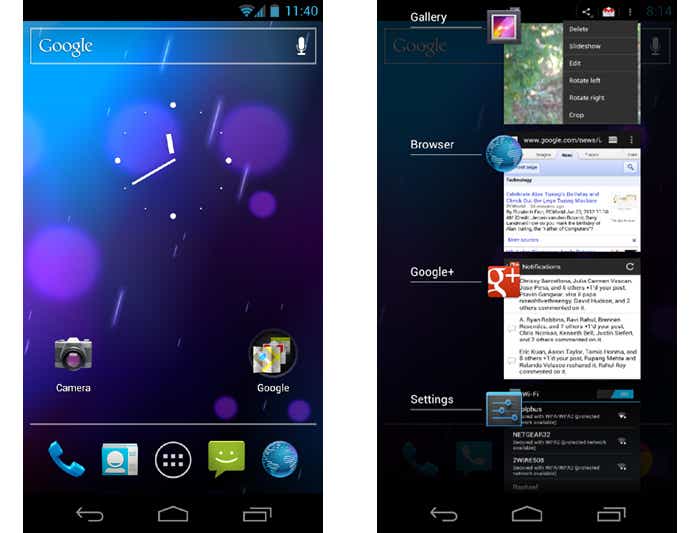
The ICS home screen and app-switching interface.
JR Raphael / IDG
Android 4.0 also made swiping a more integral method of getting around the operating system, with the then-revolutionary-feeling ability to swipe away things like notifications and recent apps. And it started the slow process of bringing a standardized design framework — known as “Holo” — all throughout the OS and into Android’s app ecosystem.
Android versions 4.1 to 4.3: Jelly Bean
Spread across three impactful Android versions, 2012 and 2013’s Jelly Bean releases took ICS’s fresh foundation and made meaningful strides in fine-tuning and building upon it. The releases added plenty of poise and polish into the operating system and went a long way in making Android more inviting for the average user.
Visuals aside, Jelly Bean brought about our first taste of Google Now — the spectacular predictive-intelligence utility that’s sadly since devolved into a glorified news feed. It gave us expandable and interactive notifications, an expanded voice search system, and a more advanced system for displaying search results in general, with a focus on card-based results that attempted to answer questions directly.
Multiuser support also came into play, albeit on tablets only at this point, and an early version of Android’s Quick Settings panel made its first appearance. Jelly Bean ushered in a heavily hyped system for placing widgets on your lock screen, too — one that, like so many Android features over the years, quietly disappeared a couple years later.
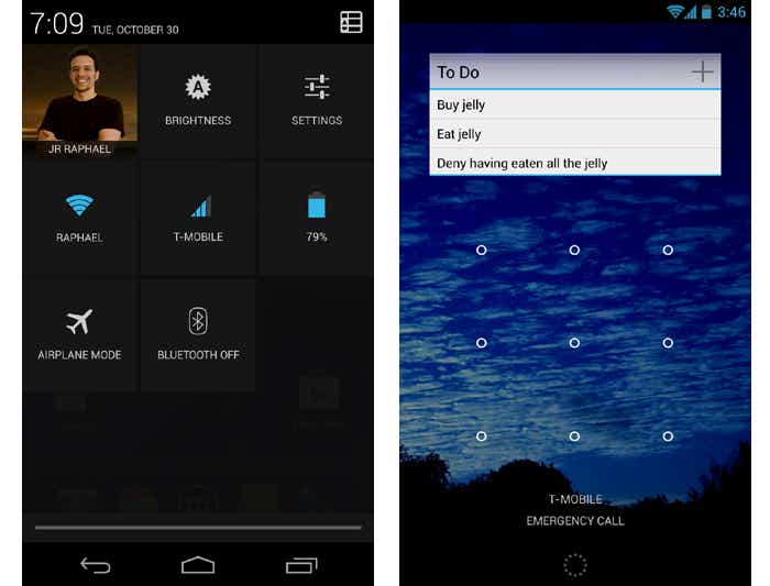
Jelly Bean’s Quick Settings panel and short-lived lock screen widget feature.
JR Raphael / IDG
Android version 4.4: KitKat
Late-2013’s KitKat release marked the end of Android’s dark era, as the blacks of Gingerbread and the blues of Honeycomb finally made their way out of the operating system. Lighter backgrounds and more neutral highlights took their places, with a transparent status bar and white icons giving the OS a more contemporary appearance.
Android 4.4 also saw the first version of “OK, Google” support — but in KitKat, the hands-free activation prompt worked only when your screen was already on and you were either at your home screen or inside the Google app.
The release was Google’s first foray into claiming a full panel of the home screen for its services, too — at least, for users of its own Nexus phones and those who chose to download its first-ever standalone launcher.
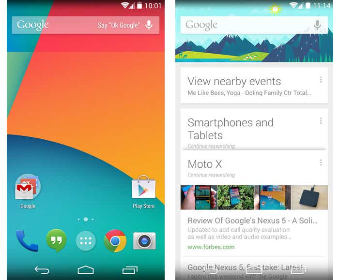
The lightened KitKat home screen and its dedicated Google Now panel.
JR Raphael / IDG
Android versions 5.0 and 5.1: Lollipop
Google essentially reinvented Android — again — with its Android 5.0 Lollipop release in the fall of 2014. Lollipop launched the still-present-today Material Design standard, which brought a whole new look that extended across all of Android, its apps and even other Google products.
The card-based concept that had been scattered throughout Android became a core UI pattern — one that would guide the appearance of everything from notifications, which now showed up on the lock screen for at-a-glance access, to the Recent Apps list, which took on an unabashedly card-based appearance.
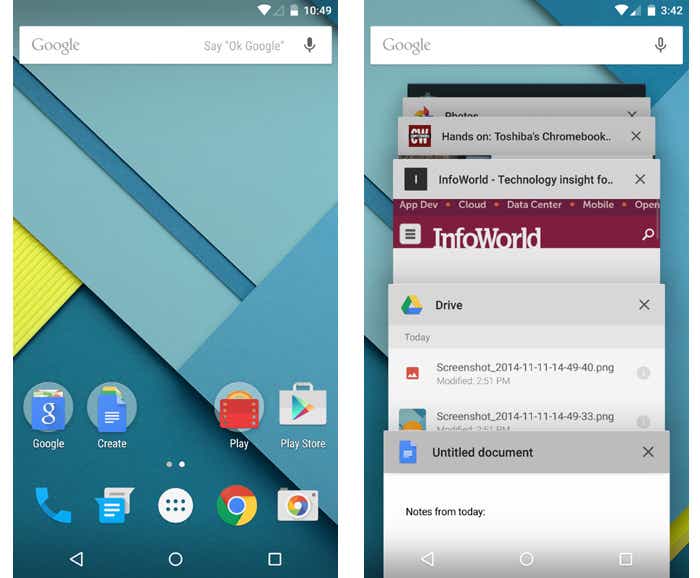
Lollipop and the onset of Material Design.
JR Raphael / IDG
Lollipop introduced a slew of new features into Android, including truly hands-free voice control via the “OK, Google” command, support for multiple users on phones and a priority mode for better notification management. It changed so much, unfortunately, that it also introduced a bunch of troubling bugs, many of which wouldn’t be fully ironed out until the following year’s 5.1 release.
Android version 6.0: Marshmallow
In the grand scheme of things, 2015’s Marshmallow was a fairly minor Android release — one that seemed more like a 0.1-level update than anything deserving of a full number bump. But it started the trend of Google releasing one major Android version per year and that version always receiving its own whole number.
Marshmallow’s most attention-grabbing element was a screen-search feature called Now On Tap — something that, as I said at the time, had tons of potential that wasn’t fully tapped. Google never quite perfected the system and ended up quietly retiring its brand and moving it out of the forefront the following year.
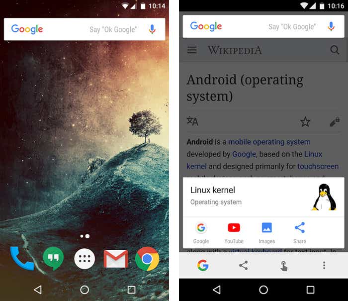
Marshmallow and the almost-brilliance of Google Now on Tap.
JR Raphael / IDG
Android 6.0 did introduce some stuff with lasting impact, though, including more granular app permissions, support for fingerprint readers, and support for USB-C.
Android versions 7.0 and 7.1: Nougat
Google’s 2016 Android Nougat releases provided Android with a native split-screen mode, a new bundled-by-app system for organizing notifications, and a Data Saver feature. Nougat added some smaller but still significant features, too, like an Alt-Tab-like shortcut for snapping between apps.
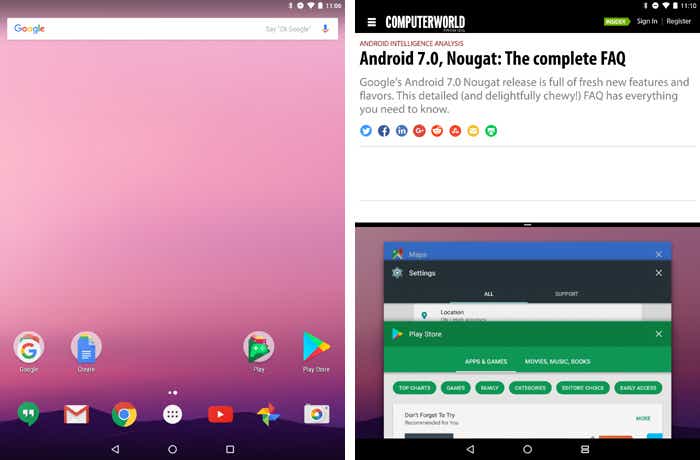
Android 7.0 Nougat and its new native split-screen mode.
JR Raphael / IDG
Perhaps most pivotal among Nougat’s enhancements, however, was the launch of the Google Assistant — which came alongside the announcement of Google’s first fully self-made phone, the Pixel, about two months after Nougat’s debut. The Assistant would go on to become a critical component of Android and most other Google products and is arguably the company’s foremost effort today.
Android version 8.0 and 8.1: Oreo
Android Oreo added a variety of niceties to the platform, including a native picture-in-picture mode, a notification snoozing option, and notification channels that offer fine control over how apps can alert you.
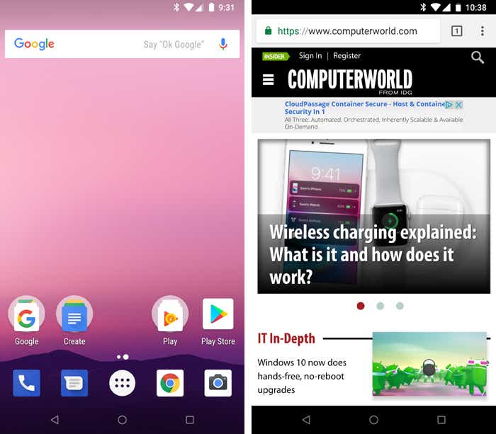
Oreo adds several significant features to the operating system, including a new picture-in-picture mode.
JR Raphael / IDG
The 2017 release also included some noteworthy elements that furthered Google’s goal of aligning Android and Chrome OS and improving the experience of using Android apps on Chromebooks, and it was the first Android version to feature Project Treble — an ambitious effort to create a modular base for Android’s code with the hope of making it easier for device-makers to provide timely software updates.
Android version 9: Pie
The freshly baked scent of Android Pie, a.k.a. Android 9, wafted into the Android ecosystem in August of 2018. Pie’s most transformative change was its hybrid gesture/button navigation system, which traded Android’s traditional Back, Home, and Overview keys for a large, multifunctional Home button and a small Back button that appeared alongside it as needed.
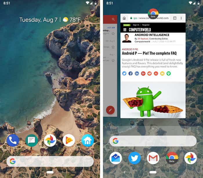
Android 9 introduces a new gesture-driven system for getting around phones, with an elongated Home button and a small Back button that appears as needed.
JR Raphael / IDG
Pie included some noteworthy productivity features, too, such as a universal suggested-reply system for messaging notifications, a new dashboard of Digital Wellbeing controls, and more intelligent systems for power and screen brightness management. And, of course, there was no shortage of smaller but still-significant advancements hidden throughout Pie’s filling, including a smarter way to handle Wi-Fi hotspots, a welcome twist to Android’s Battery Saver mode, and a variety of privacy and security enhancements.
Android version 10
Google released Android 10 — the first Android version to shed its letter and be known simply by a number, with no dessert-themed moniker attached — in September of 2019. Most noticeably, the software brought about a totally reimagined interface for Android gestures, this time doing away with the tappable Back button altogether and relying on a completely swipe-driven approach to system navigation.
Android 10 packed plenty of other quietly important improvements, including an updated permissions system with more granular control over location data along with a new system-wide dark theme, a new distraction-limiting Focus Mode, and a new on-demand live captioning system for any actively playing media.
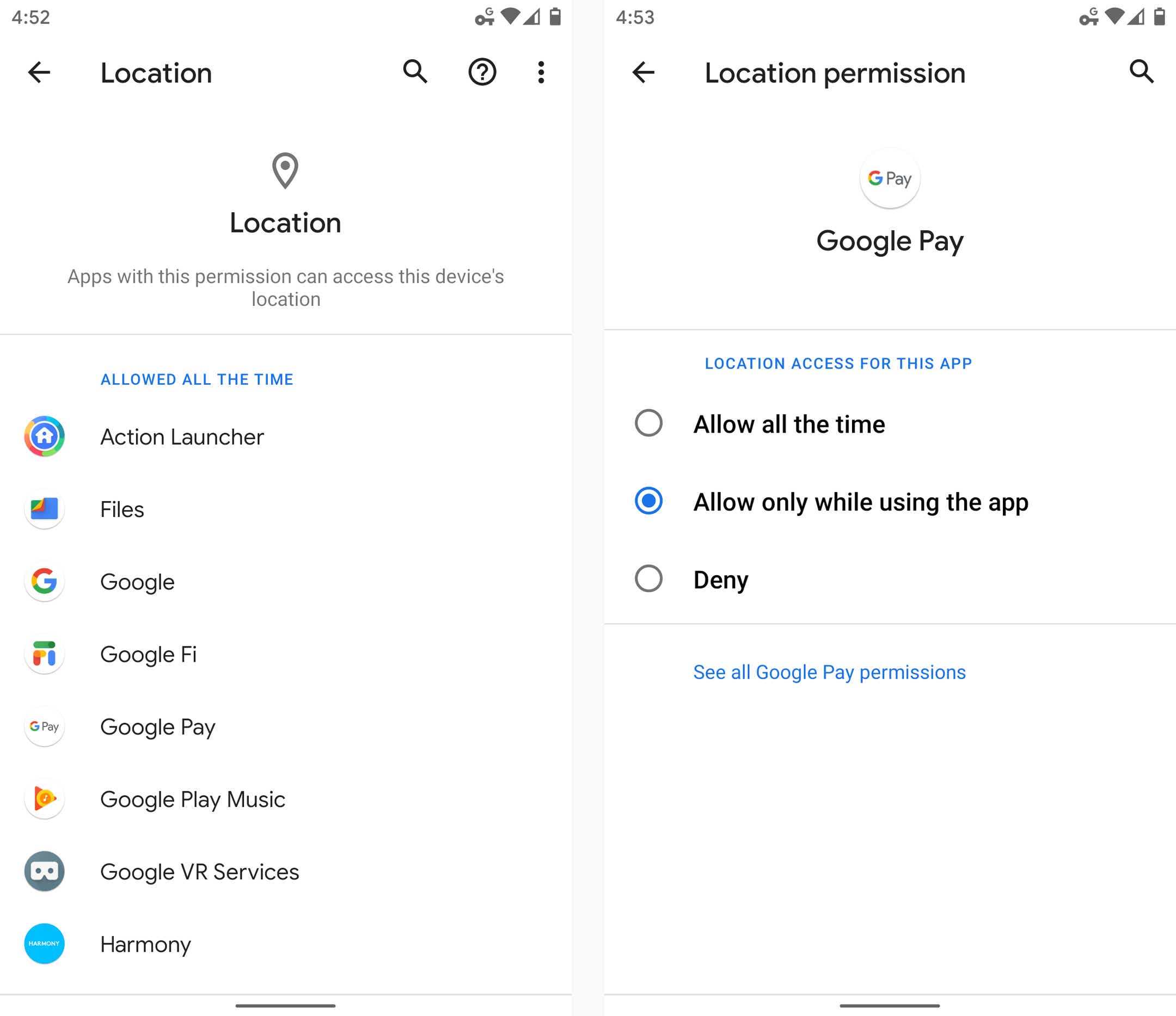
Android 10’s new privacy permissions model adds some much-needed nuance into the realm of location data.
JR Raphael / IDG
Android version 11
Android 11, launched at the start of September 2020, was a pretty substantial Android update both under the hood and on the surface. The version’s most significant changes revolve around privacy: The update built upon the expanded permissions system introduced in Android 10 and added in the option to grant apps location, camera, and microphone permissions only on a limited, single-use basis.
Android 11 also made it more difficult for apps to request the ability to detect your location in the background, and it introduced a feature that automatically revokes permissions from any apps you haven’t opened lately. On the interface level, Android 11 included a refined approach to conversation-related notifications along with a new streamlined media player, a new Notification History section, a native screen-recording feature, and a system-level menu of connected-device controls.
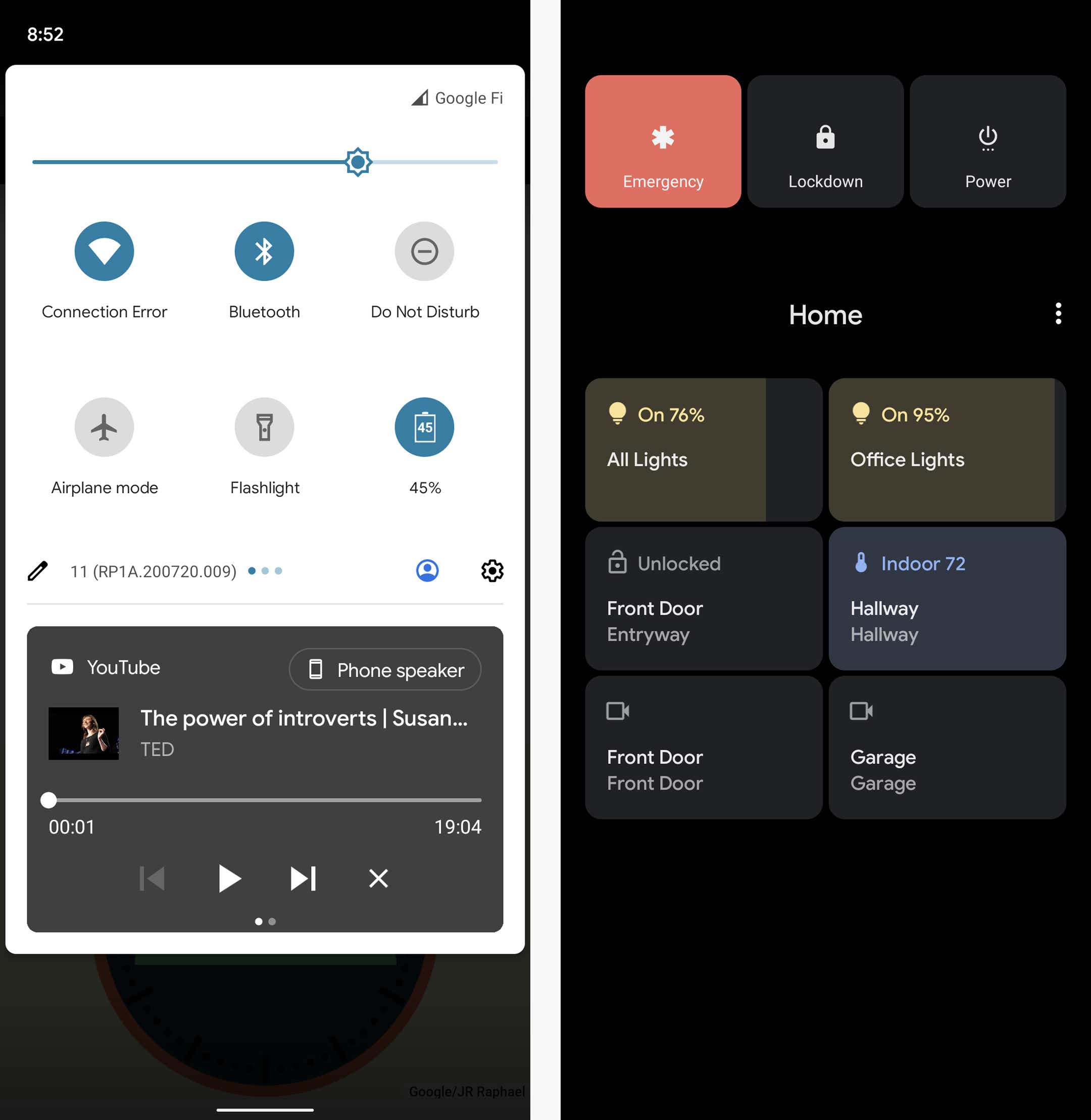
Android 11’s new media player appears as part of the system Quick Settings panel, while the new connected-device control screen comes up whenever you press and hold your phone’s physical power button.
JR Raphael / IDG
Android version 12
Google officially launched the final version of Android 12 in October 2021, alongside the launch of its Pixel 6 and Pixel 6 Pro phones.
In a twist from the previous several Android versions, the most significant progressions with Android 12 were mostly on the surface. Android 12 featured the biggest reimagining of Android’s interface since 2014’s Android 5.0 (Lollipop) version, with an updated design standard known as Material You — which revolves around the idea of you customizing the appearance of your device with dynamically generated themes based on your current wallpaper colors. Those themes automatically change anytime your wallpaper changes, and they extend throughout the entire operating system interface and even into the interfaces of apps that support the standard.
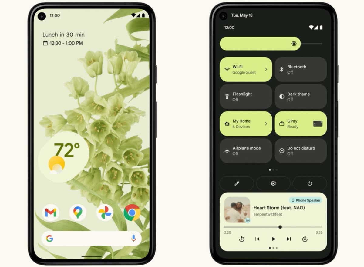
Android 12 ushered in a whole new look and feel for the operating system, with an emphasis on simple color customization.
Surface-level elements aside, Android 12 brought a (long overdue) renewed focus to Android’s widget system along with a host of important foundational enhancements in the areas of performance, security, and privacy. The update provided more powerful and accessible controls over how different apps are using your data and how much information you allow apps to access, for instance, and it included a new isolated section of the operating system that allows AI features to operate entirely on a device, without any potential for network access or data exposure.
Android version 13
Android 13, launched in August 2022, is one of Google’s strangest Android versions yet. The software is simultaneously one of the most ambitious updates in Android history and one of the most subtle version changes to date. It’s an unusual duality, and it ultimately all comes down to what type of device you’re using to experience the software.
On the former front, Android 13 introduces a whole new interface design for both tablets and foldable phones, with a renewed focus on creating an exceptional large-screen experience in the operating system itself and within apps (as first observed and reported by Computerworld in January). The enhancements in that area include a fresh framework and series of guidelines for app optimizations along with a more capable split-screen mode for multitasking and a ChromeOS-like desktop-style taskbar that makes it easy to access frequently used apps from anywhere — enhancements we now know were aimed initially at Google’s Pixel Fold and Pixel Tablet devices, though their impact and effects have certainly stretched beyond those two products.
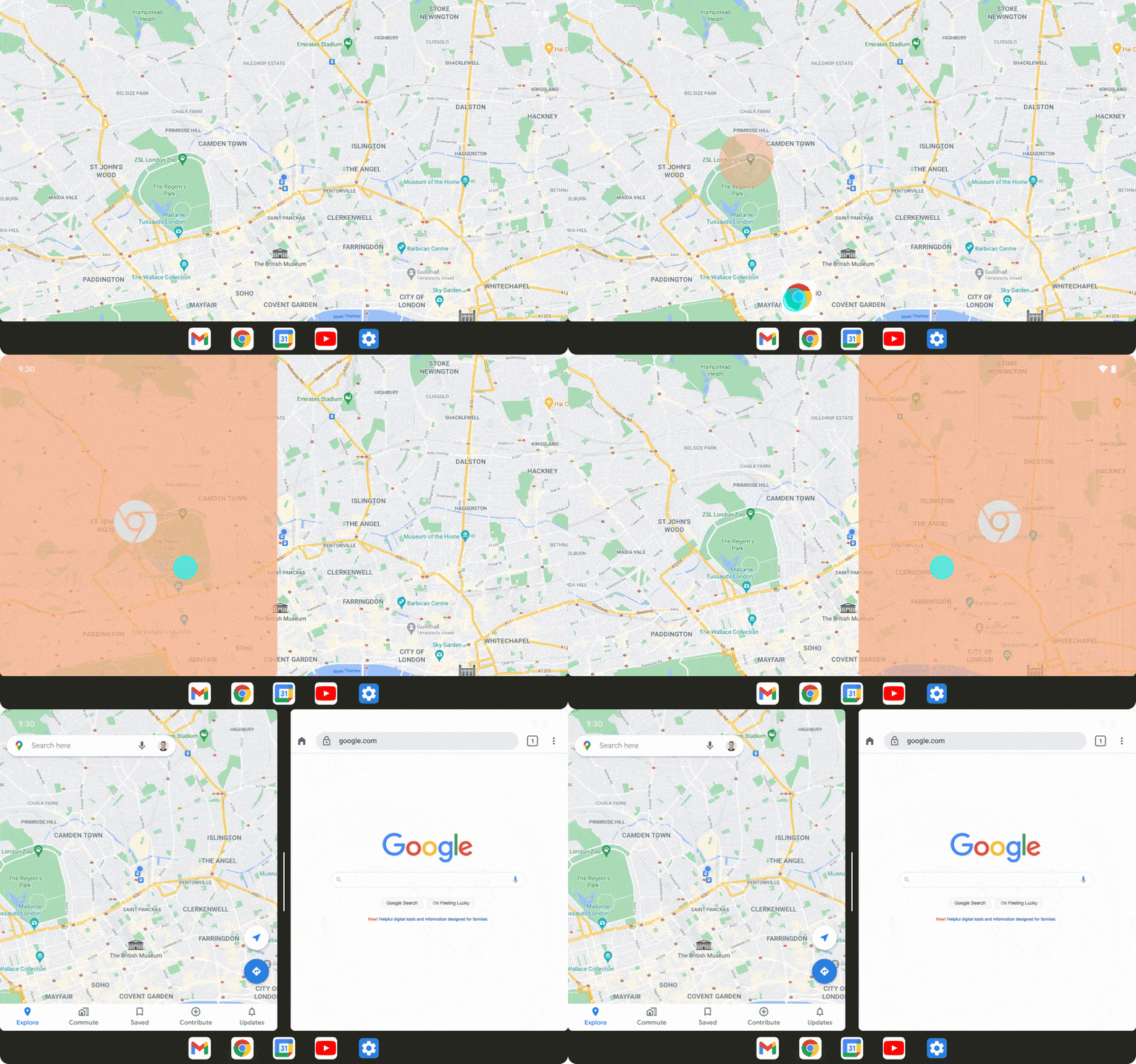
On the latter front, Android 13 also laid the groundwork for the Pixel Tablet to function as a stationary Smart Display and then allow you to detach its screen and use it as a tablet. The software introduced support for a whole new series of shared-surface widgets and screensavers along with an expanded multiuser profile system for that purpose.
On regular phones, Android 13 is much less significant — and in fact, most people probably won’t even notice its arrival. Along with some minor visual refinements, the software introduces an expanded clipboard system that allows you to see and edit text as it’s copied, a native QR code scanning function within the Android Quick Settings area, and a smattering of under-the-hood improvements connected to privacy, security, and performance.
Android version 14
Following a full eight months of out-in-the-open refinement, Google’s 14th Android version landed at the start of October 2023 in the midst of the company’s Pixel 8 and Pixel 8 Pro launch event.
Like the version before it, Android 14 doesn’t look like much on the surface. That’s in part because of the trend of Google moving more and more toward a development cycle that revolves around smaller ongoing updates to individual system-level elements year-round — something that’s actually a significant advantage for Android users, even if it does have an awkward effect on people’s perception of progress.
But despite the subtle nature of its first impression, Android 14 includes a fair amount of noteworthy new stuff. The software introduces a new system for dragging and dropping text between apps, for instance, as well as a new series of native customization options for the Android lock screen.
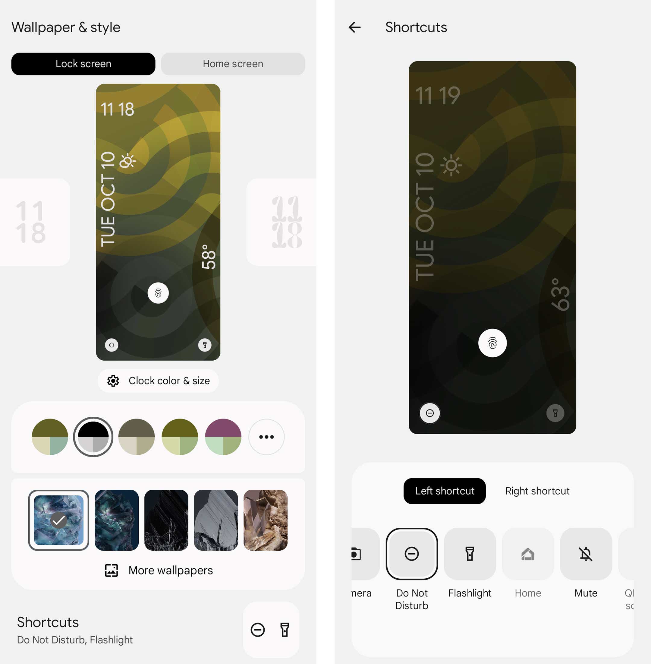
Android 14 includes options for completely changing the appearance of the lock screen as well as for customizing which shortcuts show up on it.
JR Raphael / IDG
Android 14 provides a number of new improvements to privacy and security, too, including a new settings-integrated dashboard for managing all your health and fitness data and controlling which apps and devices can access it. And it adds in a more info-rich and context-requiring system for seeing exactly why apps want access to your location when they request such a permission.
The software also sports a series of significant accessibility additions, such as an enhanced on-demand magnifier, an easier way to increase font size in any app, improved support for hearing aid connections, and a built-in option to have your phone flash its camera light anytime a new notification arrives.
Beyond that, Android 14 features a first taste of Google’s AI-generated custom wallpaper creator, though that’s available only on the Pixel 8 and Pixel 8 Pro to start.
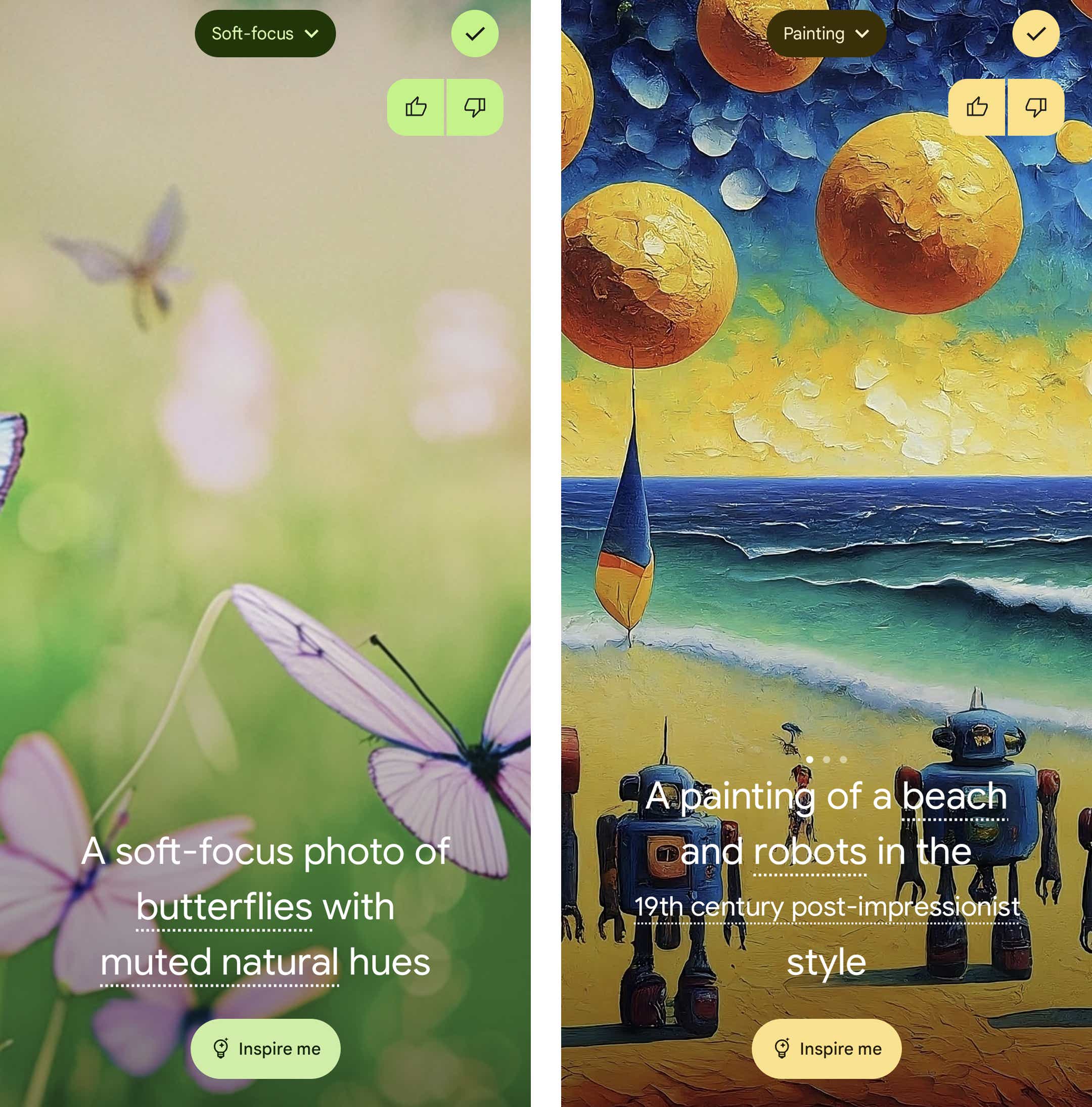
You can generate all sorts of interesting wallpapers in seconds via Android 14’s AI generator feature — but only on the Pixel 8 or Pixel 8 Pro for now.
JR Raphael / IDG
Android 14 rolled out to Google’s actively supported Pixel devices in early October, on the day of its release, and has been making its way slowly but surely to other Android phones and tablets in the weeks since.
Android version 15 (beta)
Google got its first developer preview of 2024’s Android 15 update out into the universe in late February and moved on to a public beta build of the software in early April.
As typically happens with new Android versions, the beta software is starting out somewhat bare bones — with most of the higher-profile, headline-worthy features still out of sight and under wraps. At this point, the official elements Google’s discussing and making visible revolve primarily around under-the-hood improvements and developer-aimed adjustments.
That being said, we have a pretty good idea of what front-facing features we might see as the development moves forward. Bits of behind-the-scenes code suggest Android 15 could include a new system for stopping overly aggressive notifications, along with a simpler way to tap into Android’s split-screen system, an “Adaptive Touch” feature that’d automatically adjust your screen to be as responsive as possible in different scenarios, and the long-awaited return of the now-12-year-old lock screen widgets concept — in certain contexts, at least.
It also looks increasingly likely that Android 15 will introduce a new “Private Space” option that’ll make it possible to create a separate, locked-down profile for securing especially sensitive apps and data (something some device-makers have added into their versions of the software for some time but that’s never before been a consistent, official part of the platform).
Google is expected to release four Android 15 beta versions in all, with a final release following sometime in the late summer to early fall months — as early as July, potentially, though that timing is always a floating target. (For context, remember: Android 14 didn’t arrive until early October. Android 13 before it showed up in mid-August. Anything’s possible.)
We’ll almost certainly hear much more about Android 15’s progress and at least some of the software’s significant features at the Google I/O company conference in May, so stay tuned: This story is only just getting started, and the biggest news is absolutely still ahead of us.
This article was originally published in November 2017 and most recently updated in April 2024.

