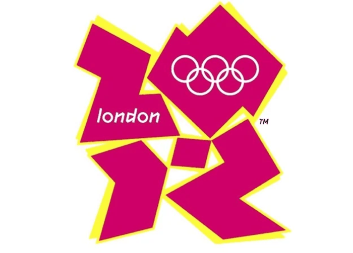
Neon colors, clashing fonts, asymmetry, visual noise — what used to be dismissed as bad design is now a deliberate strategy. The rise of “ugly” branding marks a shift in how brands approach identity. In a world saturated with polished, templated visuals, standing out means breaking the rules.
This article explores why this aesthetic works, how it creates impact, and where the line lies between brave and chaotic.
This article was prepared by experts at Turbologo.
What ugly branding is and where it comes from?
Ugly branding is a design style that embraces discomfort, imbalance, and visual tension. It rejects traditional rules of alignment, color harmony, and hierarchy. Instead, it channels energy from DIY culture, underground media, early internet aesthetics, and streetwear visuals.
This movement responds to the overuse of minimal, safe, and “nice” branding. When everything looks refined, rawness becomes attention-grabbing. Exploring unconventional logo ideas can help embrace this “ugly” branding that speaks louder, faster — and often with irony.
Why “ugly” branding works?

The power of ugly branding lies in its visibility. It’s disruptive by design. When users scroll past dozens of near-identical ads or sleek websites, a chaotic visual instantly catches the eye.
This aesthetic also feels more honest. It signals a human presence, a sense of experimentation, or even a rebellious attitude. In some cases, it’s used to mock the overly serious tone of traditional branding — creating an intentionally awkward, but unforgettable impression.
Where to draw the line between bold and broken?
For ugly branding to succeed, the chaos must be intentional. Every design element — however strange — should be rooted in an idea. The difference between “ugly” and ineffective is structure. There must be a system behind the visual noise.
Successful ugly branding often hides order within disorder. Repetition, grids, limited color ranges, or consistent typographic behavior bring balance to the chaos. The audience should feel disrupted, not lost.
Mistakes that ruin ugly branding
What breaks this style instead of making it work:
- Using random elements with no structure or logic
- Overloading the design with effects that dilute the message
- Losing consistency across platforms or touchpoints
- Prioritizing shock over clarity or communication
- Failing to adapt the design to digital or physical formats
Ugly branding is not about being careless. It’s about using visual discomfort to engage. Without discipline, it turns into noise. With direction, it becomes a signature style.
Who should use ugly branding and why?
This approach works well for creative industries, independent media, fashion labels, cultural platforms, or startups targeting younger, design-aware audiences. These groups are often more open to experimentation and visual irony.
Ugly branding signals boldness and a refusal to play by mainstream rules. It’s especially effective when the goal is to disrupt a boring market or stand out in a crowded digital space. For new players, it can create fast recognition without relying on legacy or scale.
How to systemize chaos without losing personality?
Even the most rebellious visuals need boundaries. Build your branding system with constraints: consistent margins, color palettes, typographic pairs, or visual ratios. Then allow distortion and layering within those rules.
Tips to build structure into ugly branding:
- Limit how many “wild” elements appear at once
- Create a repeatable visual rhythm, even in asymmetric layouts
- Use type intentionally — even if it looks chaotic
- Balance contrast with space to avoid overwhelming the viewer
- Treat visual tension as an effect, not a base
Ugly branding is most effective when it looks spontaneous but is deeply considered. Behind every shocking design choice should be a reason and a message.

