To celebrate the 15th birthday of its Chrome browser, Google announced a number of upgrades on Thursday. These include the Chrome browser Material You redesign, a new coat of paint on the Chrome Web Store, and ways to make searching the web easier. All of these changes will also filter down to ChromeOS and Chromebooks. And some of them are already available if you know which experimental flags to enable.
Chrome browser Material You look and feel
Once the updates arrive on your device, you’ll notice a cleaner, more modern design for Chrome. And if you use a recent Android phone, you’ll feel right at home. It’s taken Google a few years but now the Chrome browser has the Material You design found in Android.
You can see the design changes on my Chromebook shown below, as I’ve been testing the Material You interface for a while now.
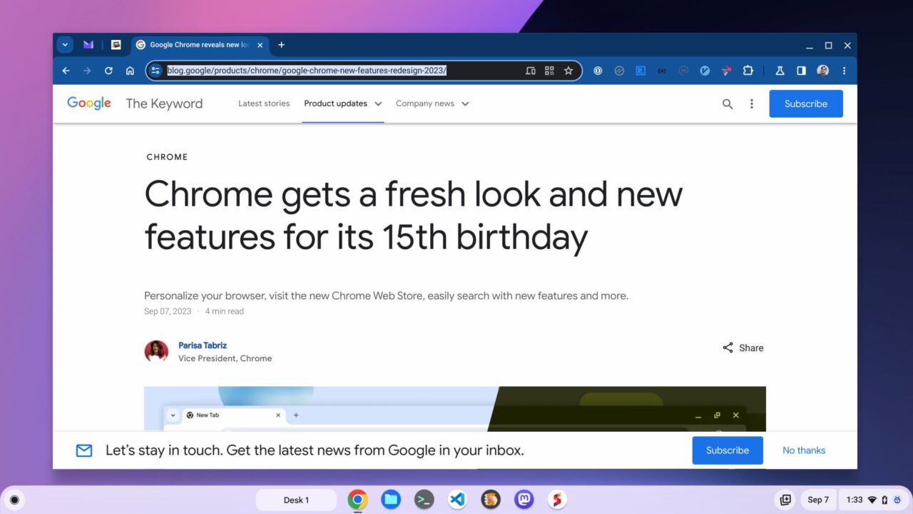
Tabs have rounded corners, for example, while the Omnibox, or URL address bar has an updated design as well. I’ve also noticed updated fonts, text styling, and icons in the Chrome browser. Google says the icons have a “focus on legibility and created new color palettes that better complement your tabs and toolbar.” I would agree.
An updated, more useful browser menu
The old three-dot menu of Chrome is revamped too, although I’ve seen and reported on this before. Some settings are moved to the top level, requiring fewer clicks to use, for example. And you can clearly see the updated fonts, which I think look excellent.
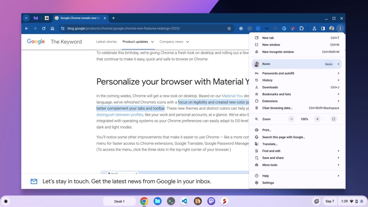
Look closely and you’ll see something else upcoming that I shared recently: A setting for my user profile. You won’t see this on Chromebooks just yet unless you’re using the Lacros browser like I am. I prefer this version of Chrome for Linux on my Chromebook mainly because it brings simple user profile switching. Speaking of which…
Chrome browser profiles with custom colors and themes
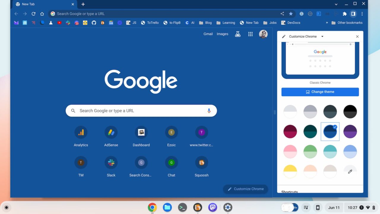
Google today pointed out that custom colors and themes are available for all of your Chrome browser profiles. So you can create one theme for a work account and one for a personal account. That makes it easier to see which profile you’re in.
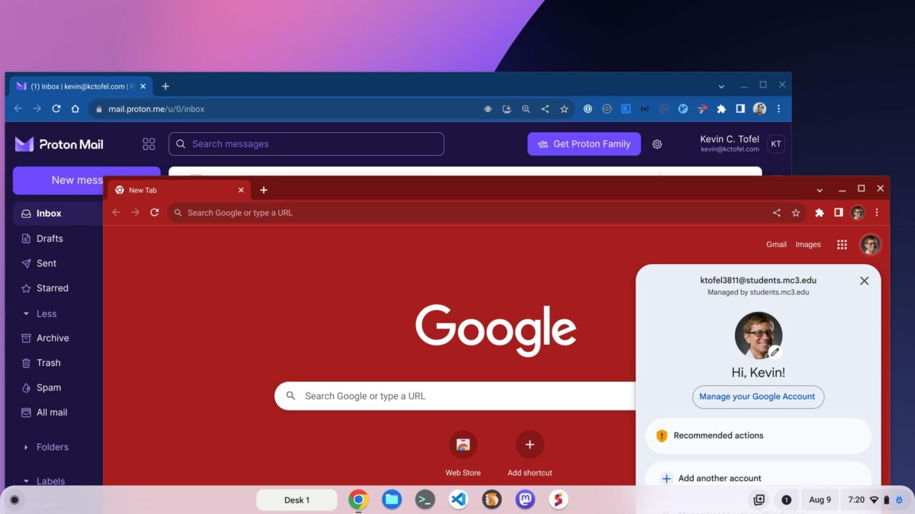
This too is another feature I’ve been using. Although the above photo represents two different profile themes, I quickly changed my personal theme away from that garish red one!
Customizing colors and themes recently became easier with new side-panel controls. I shared this update with the ChromeOS 114 release and it offers a much better customization experience.
Google browser search in your side panel
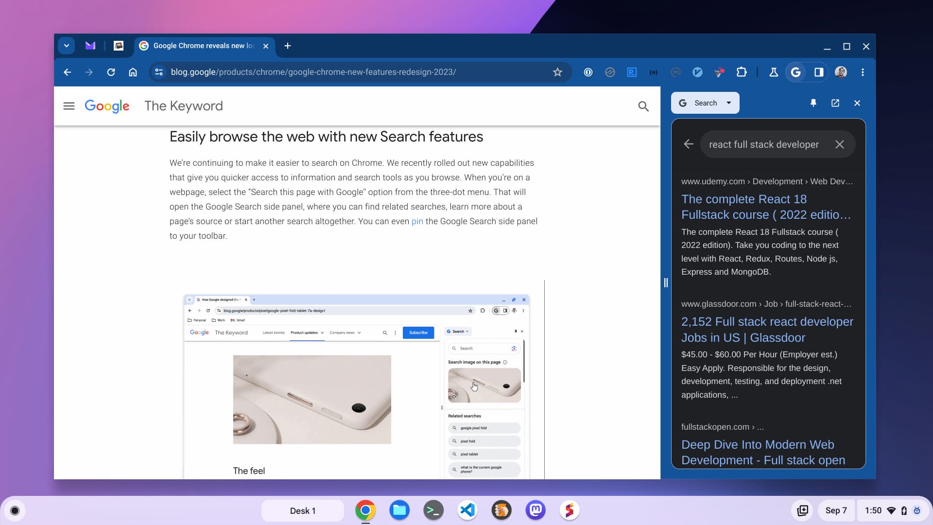
I’ve been following the Chrome, and ChromeOS, side panel for some time now. One of the latest updates is coming soon with the new Chrome browser. If you want to have a part-time or dedicated Google Search panel, you can have that with just a click.
I’ve opened my side panel in the below photo and chose the Search option to illustrate this.
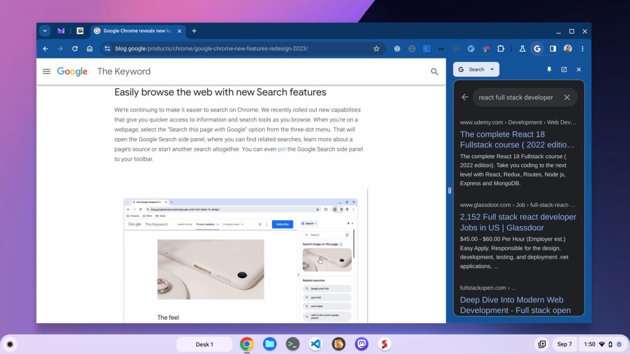
Personally, I don’t use this feature much but it is nice to have it one click away. I’ll open the panel, use it, and then close it. However, Google says you can pin the Search panel to keep it persistent.
The Chrome Web Store looks fresh and new
Folks who love their Chrome extensions are probably tired of looking at the old Chrome Web Store. Thankfully, it too gets a Material You design language update. There’s a public preview of it available right here.
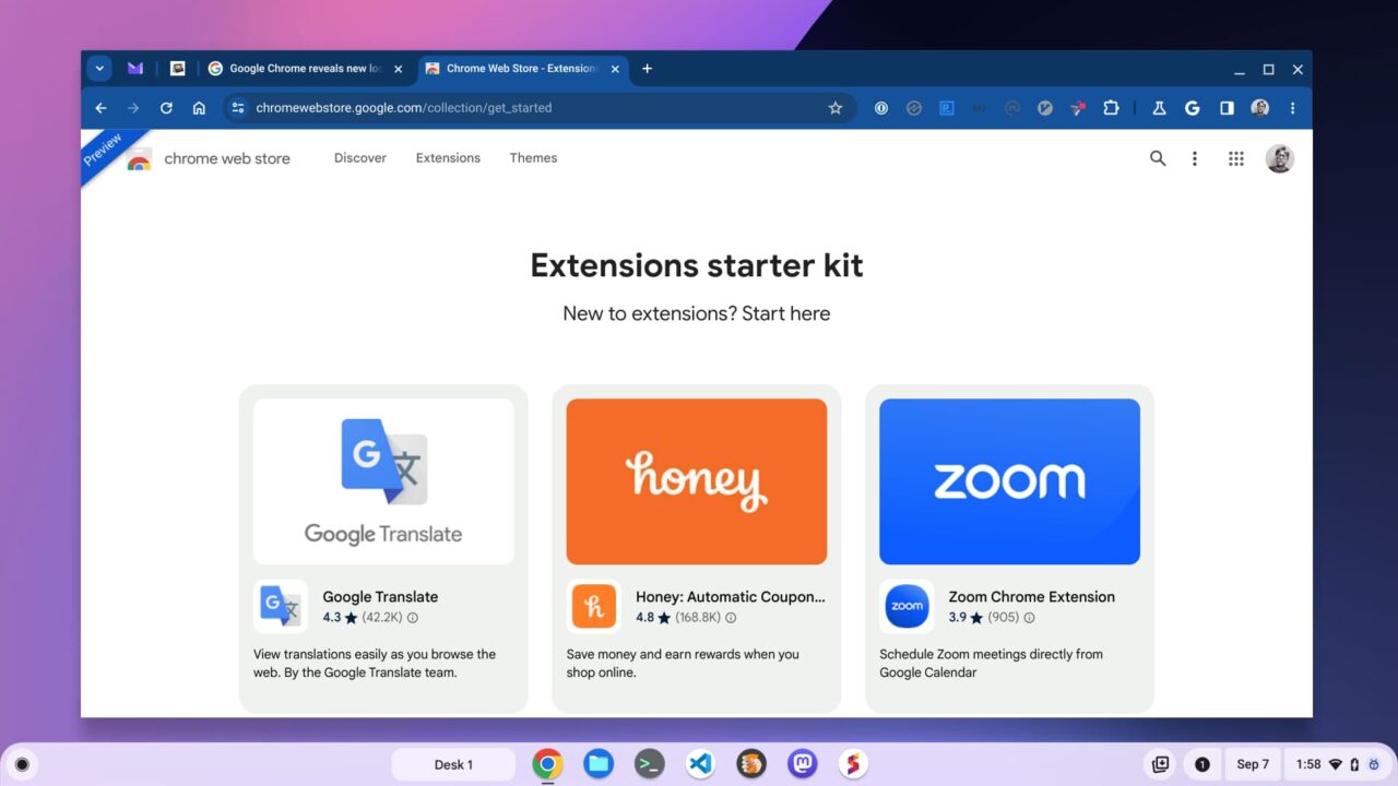
In addition to the updated design elements, I like the curation effort Google is putting into the Chrome Web Store. Sometimes it’s harder than it should be to find just the right browser extension.
Aside from the public preview of the store, the Chrome browser updates are coming in the next few weeks. If you don’t see them on your computer, that would be why. This has been a long time coming though. Waiting another few weeks or so will be worth it.
The post Here comes the Chrome browser Material You redesign appeared first on About Chromebooks.

